

'%20x='0'%20y='0'%20height='100%25'%20width='100%25'%20%0A%20%20%20%20%20%20%20%20%20%20xlink%3Ahref='data:image/jpg;base64,/9j/2wBDAAYEBQYFBAYGBQYHBwYIChAKCgkJChQODwwQFxQYGBcUFhYaHSUfGhsjHBYWICwgIyYnKSopGR8tMC0oMCUoKSj/2wBDAQcHBwoIChMKChMoGhYaKCgoKCgoKCgoKCgoKCgoKCgoKCgoKCgoKCgoKCgoKCgoKCgoKCgoKCgoKCgoKCgoKCj/wAARCAAGAAoDASIAAhEBAxEB/8QAFgABAQEAAAAAAAAAAAAAAAAAAAUG/8QAIhAAAgEDAwUBAAAAAAAAAAAAAQIDAAURBCFBEhMVMVFh/8QAFQEBAQAAAAAAAAAAAAAAAAAAAwX/xAAYEQADAQEAAAAAAAAAAAAAAAAAAQIDUf/aAAwDAQACEQMRAD8A1WvuXTo18YskTKCFWd+6oyOMjbf39qFFfbtHEiS3GYSKAGEYAUHnH5SlBOtdJ7pn/9k='%3E%3C/image%3E%3C/svg%3E)
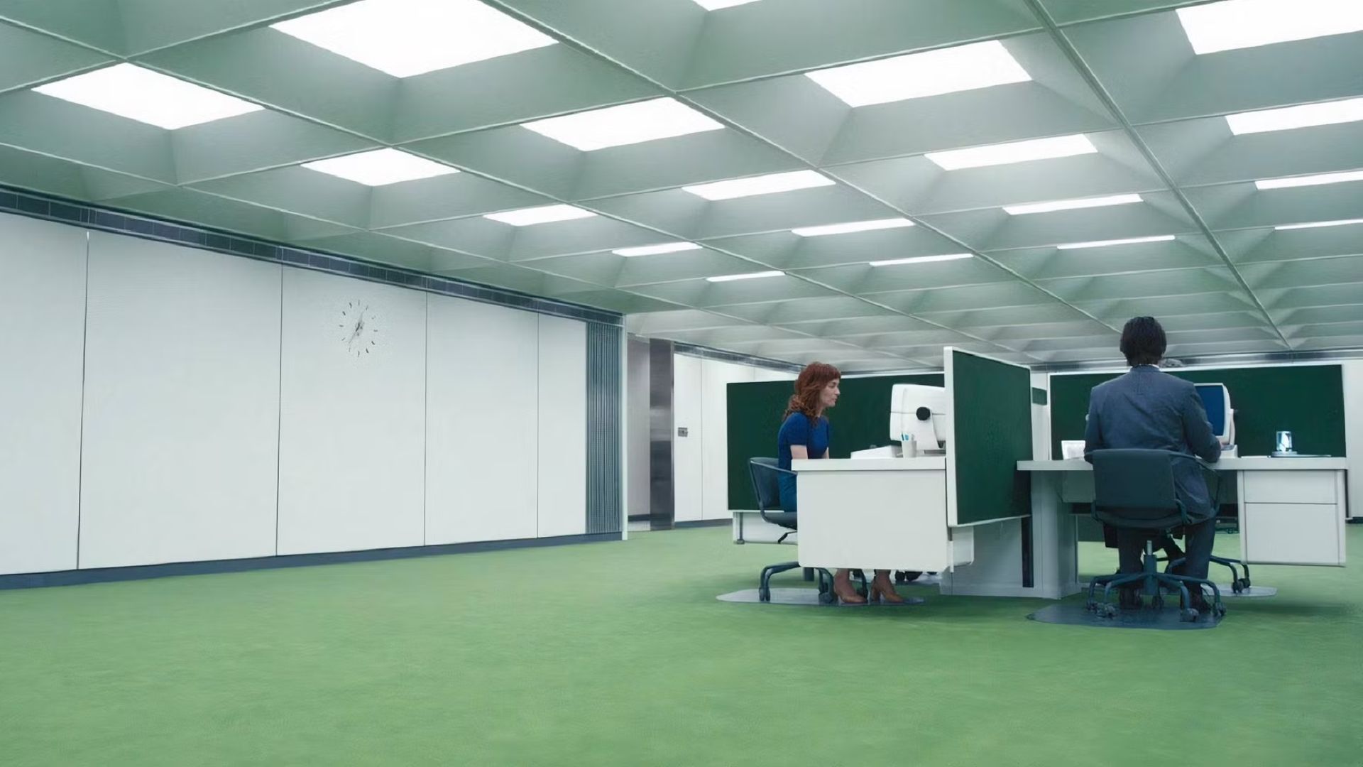
Severance on Apple TV+ has become a focal point among viewers due to its enigmatic plot and bold visual moments, such as the neon green carpet at Lumon's MDR office. You may wonder why Lumon's carpet is that color of green. It's all the result of a savvy production choice. While the carpet appears toned down on the show, it's a bright, nearly astroturf green on set, in real life.
The producers of the show had a reason for selecting this vibrant color. They knew that once the color grading happened in post-production, the carpet would look in the muted color we are familiar with from the show. This was done based on Lars Tunbjork's '90s office photography, where they wanted to achieve the drabness of mundane office environments.
By beginning with a bright color, they could dull it down to the desired appearance. This is comparable to how old-school film processes such as Technicolor tweaked colored Dorothy's ruby slippers darker than they actually were in burgundy. The premise here is that a lighter initial point allows them to end up with a more subtle appearance following editing.
The YouTube short by Magnify helps fans make sense of this:
This attention to detail is something seen throughout the show, pairing surreal aesthetics with diligent production efforts. It's one of the things that makes Severance's visuals so engrossing and memorable.
Production techniques and color grading of the neon green in Severance's set design
Severance's production design illustrates a new approach to color. The team found inspiration in artists such as Lars Tunbjork. They chose a neon green carpet to counteract what the color will look like once edited.
This is much like how old Technicolor films required bright colors to achieve the correct tones at the end. The crew did this to synchronize everything on set with the show's strange mood.
With this method, even the carpet becomes part of telling the story of the series. It's a combination of being great at your job and having an awesome imagination. It indicates how critical adjustments during post-production are to alter the appearance of what you film.
This way, everything on the set perfectly suits Severance's creepy atmosphere. The result is a show that looks incredible due to the imagination and meticulous planning.
The symbolic meaning of the color green in Severance
In Severance, green is more than just a component of the show's aesthetic. It's very significant and not easily discerned at first. Red and blue indicate what is out there and what is in here, regarding the Lumon company. Green, however, is somewhat of an enigma.
You'll see green in different areas of the show, such as on secret team badges and the dividers that divide up areas. It implies that things are going on in Lumon that aren't immediately apparent. The color even appears in the animated opening, which gives us a glimpse of what the characters may be experiencing beneath the surface. It blends the real and the artificial.
What's so fascinating about green is that it can refer to two things simultaneously: it can be about new life and growth, and also about things decaying and deteriorating. This aligns with the central concepts of the show, which is full of secrets and tension. It makes audiences want to peer closer at what's actually happening beneath the flawless surface of Lumon.
Stream Severance now on Apple TV+.
More for Severance fans: An unlikely team to shut down Lumon | Jame Eagan